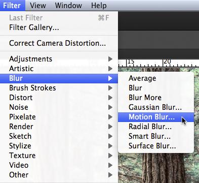
Tutorial 1
http://www.photoshopessentials.com/photo-editing/apply-image-cs6/
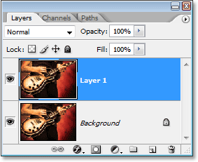
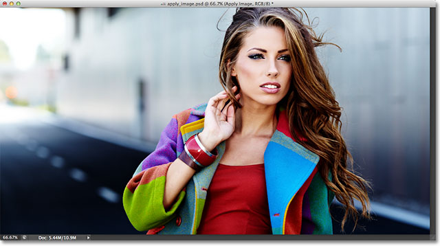
The first thing we need to do before we go any further is make a copy of our image. If we look in my
Layers panel, we see my original photo sitting all by itself on the
Background layer:
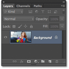
The Layers panel showing the image on the Background layer.
Let's quickly duplicate the Background layer using a handy shortcut. Press Ctrl+Alt+J (Win) /Command+Option+J (Mac) on your keyboard. This tells Photoshop not only to create a copy of the layer but to first pop open the New Layer dialog box so we can name the new layer before it's added. Name the layer "Apply Image", then click OK to close out of the dialog box:
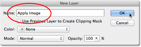
The New Layer dialog box.
If we look again in my Layers panel, we see a copy of the image sitting on the new "Apply Image" layer directly above the Background layer. It's always best to give layers descriptive names like this, otherwise we're stuck with the generic names Photoshop gives them, like "Layer 1", which tells us nothing about what the layer is being used for:
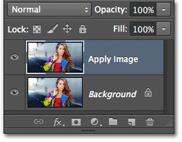
A copy of the image appears on the Apply Image layer.
As I mentioned at the beginning of the tutorial, we usually select blend modes from the Layers panel because we normally apply them to an entire layer. The Blend Mode option is found in the upper left corner of the Layers panel. As a quick example, I'll change the blend mode of my Apply Image layer from Normal (the default) to Soft Light:
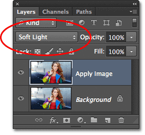
Changing the layer blend mode to Soft Light.
This changes how the Apply Image layer interacts with the Background layer below it. Soft Light is part of the
Contrast group of blend modes because it increases the overall contrast of the image, as we can see with my photo. Color saturation has also been given a slight boost:
The photo after changing the layer blend mode to Soft Light.
I'll change my blend mode to Normal to switch it back to the default setting:
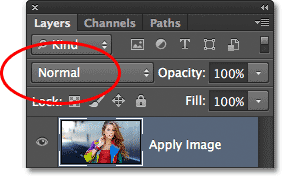
Changing the blend mode back to Normal.
So if changing the blend mode in the Layers panel is great for blending layers together, where are these individual color channels, and how do we use blend modes with them? Well, to answer the first part of the question, if you look more closely at the top of your Layers panel, you'll see that it's actually grouped in with two other panels - Channels and Paths - with each panel having its own name tab along the top. Click on the Channels name tab:
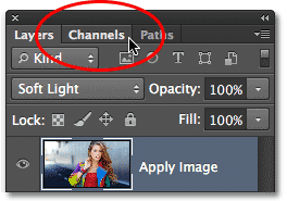
Clicking on the Channels name tab.
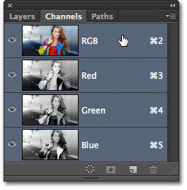
This switches us to the Channels panel where we can see the individual Red, Green and Blue color channels that make up our image. The RGB channel at the top isn't really a channel. It's the result of the Red, Green and Blue channels being merged together, or in other words, it's what we see as the full color version of our image (every color in the image is made from some combination of red, green and blue):
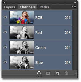
We can find the individual color channels in the Channels panel.
We can select an individual color channel simply by clicking on it. I'll click on the Red channel to select it:
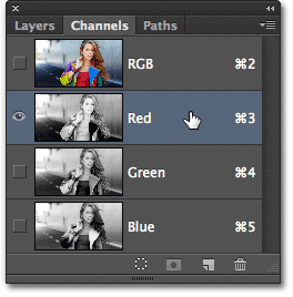
Selecting the Red channel.
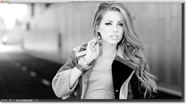
Selecting the Red channel temporarily turns off the Green and Blue channels and lets us see the Red channel on its own in the document window. Photoshop displays color channels as grayscale images, and each channel gives us a different looking grayscale image. Here's what my Red channel looks like in the document window. If you compare this grayscale version with the original full color version, you'll notice that areas that contained lots of red in the full color version appear lighter in this grayscale version, while areas that contained little or no red appear darker:
The Red channel's grayscale image.
Next, I'll click on the Green channel in the Channels panel to select it, which temporarily turns off the Red and Blue channels:
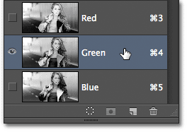
Selecting the Green channel.
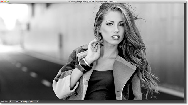
The Green channel is now displayed as a grayscale image in the document window. Notice that it looks considerably different from the Red channel. Again, if you were to compare it with the original full color version, you'd notice that areas that contained lots of green appear lighter in this grayscale version, while areas with little or no green appear darker:
The Green channel's grayscale image.
Finally, I'll click on the Blue channel in the Channels panel to select it, which turns off the Red and Green channels:
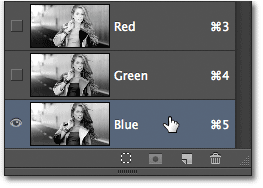
Selecting the Blue channel.
And now we see the Blue channel in the document window, which again gives us a different looking grayscale version from the Red and Green channels. This time, the more blue an area contained in the full color version, the lighter it appears in the grayscale version, while areas with little or no blue appear darker. When we choose an individual color channel in the Apply Image dialog box, as we'll do in a moment, keep in mind that it's actually these different grayscale versions of the image, with their different brightness values, that we're selecting:
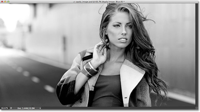
The Blue channel's grayscale image.
To switch back to the full color version of the image, click on the RGB channel at the top of the Channels panel. This turns all three color channels back on:
Selecting the composite RGB channel.
And we're back to seeing the full color version of the image once again:

The full color version of the photo re-appears in the document window.
The Apply Image Command
Now that we know where to find the color channels and what each one looks like as a grayscale image, let's answer the second part of the question - how do we apply blend modes to them? You may have noticed that there is no Blend Mode option at the top of the Channels panel like there is with the Layers panel. In fact, we don't actually need the Channels panel open at all, so let's switch back over to the Layers panel by clicking on its name tab:
Switching back to the Layers panel.
To apply blend modes to individual color channels, we use Photoshop's Apply Image command. To get to it, go up to the Image menu in the Menu Bar along the top of the screen and choose Apply Image:
Go to Image > Apply Image.
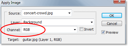
This opens the Apply Image dialog box. It can look a bit intimidating if you've never used it before, but for what we're doing here, it's actually quite simple. In fact, there's really only two options we'll be using - Channel andBlending:
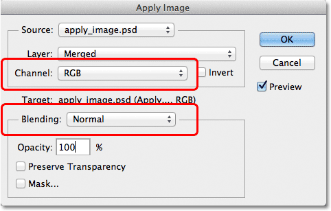
The Channel and Blending options in the Apply Image dialog box.
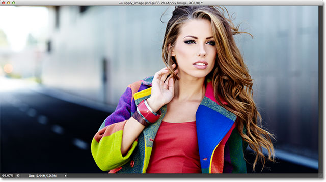
The Channel option is where we select the color channel we want to use. By default, it's set to RGB which, if you remember, was that RGB composite channel we saw at the top of the Channels panel (the one that blends the Red, Green and Blue channels together to create our full color image). The Blending option below it is where we select the blend mode we want to use. If we leave the Channel option set to RGB and simply choose a blend mode from the Blending option, we'll get the exact same result as if we had selected a blend mode from the Layers panel. For example, I'll select the Soft Light blend mode for the Blending option (with Channel set to RGB):
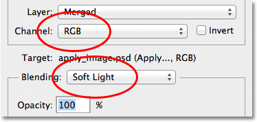
Leaving Channel set to RGB while changing Blending to Soft Light.
And here we see that my image looks no different than when I selected the Soft Light blend mode from the Layers panel earlier. We get the exact same boost in contrast and color saturation:

The Blending option works the same as the Blend Mode option in the Layers panel when Channel is set to RGB.
But here's where things get interesting. Instead of leaving the Channel option set to RGB, we can choose any of the three individual color channels. I'll leave my Blending option set to Soft Light but I'll change the Channel option from RGB to Red so I'm blending just the red color channel:
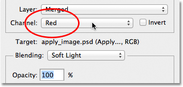
Selecting the Red color channel.
This time, we get something different. We're still seeing an overall boost in contrast with the Soft Light blend mode, but by blending only that grayscale image for the Red channel that we saw earlier, we get a different effect. The woman's skin looks much lighter than before. So does her hair, along with her red top and the areas of red, orange and yellow in her jacket. Basically, anything that contains lots of red now looks lighter. Likewise, areas that contain little or no red, like the blue and green areas of her jacket, appear darker than before:
The effect of blending the Red color channel with the Soft Light blend mode.
Let's see what happens if I select the Green channel in the Channel option (with Blending still set to Soft Light):
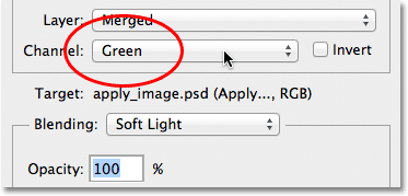
Switching from the Red channel to the Green channel.
With the Green channel selected, we get another variation on the effect. This time, areas with lots of green appear lighter, while areas with more red or blue in them look darker. The most immediately obvious difference is with the woman's skin which appears darker and with more detail than we saw with the Red channel:
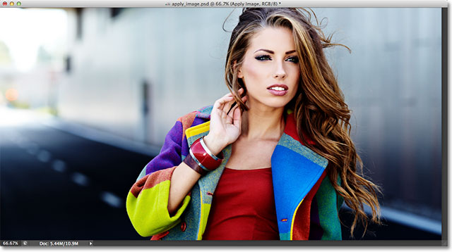
Blending the Green channel with Soft Light.
Next, I'll set the Channel option to Blue:
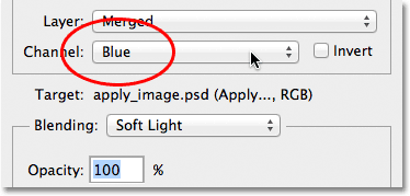
Selecting the Blue channel.
And here, we get a third variation, with areas of blue appearing lighter while areas with mostly red or green appearing darker. These variations of the effect wouldn't be possible (at least not without more time and effort) if we didn't have the access to the individual color channels that Photoshop's Apply Image command gives us:
Each color channel gives us a unique variation of the effect.
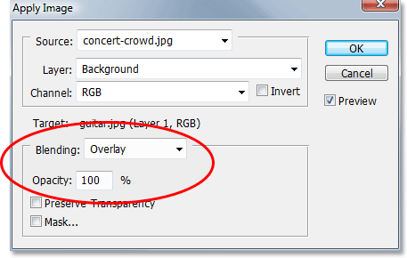
Of course, we're not limited to using just the Soft Light blend mode with our color channels. We can use any of the blend modes we'd normally select from the Layers panel. I'll leave my Channel option set to Blue but I'll change my Blending option from Soft Light to Overlay:
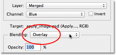
Selecting the Overlay blend mode for the Blue channel.
Like Soft Light, Overlay is a contrast-boosting blend mode but with a stronger, more intense result:
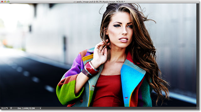
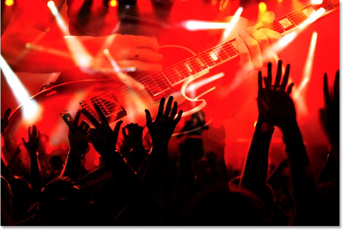
Blending the Blue channel with the Overlay blend mode.
Here's what the same Overlay blend mode gives us if we change the Channel option from Blue to Green:
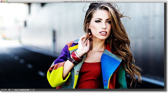
Blending the Green channel with Overlay.
And here's what the Red channel looks like with Overlay:
Blending the Red channel with Overlay.
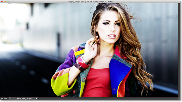
The Red channel is looking too intense with the Overlay blend mode, but we can easily tone things down if needed simply by lowering the opacity of the blending. You'll find the Opacity option directly below the Blending option and it works the same way here as it does in the Layers panel. By default, it's set to 100%. I'll lower mine down to 60%:
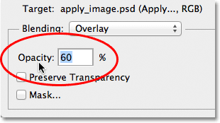
Lower the Opacity value to reduce the intensity of the blending effect.
With the opacity lowered, we've brought back some of the detail in the highlights and shadows:
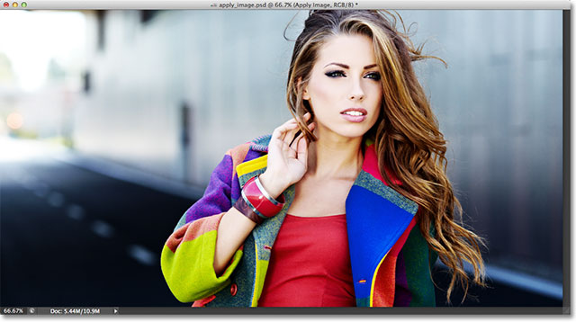
The image after lowering the opacity of the Overlay blend mode.
If, at any time, you want to compare what you're doing with the original version of the image, simply uncheck thePreview option over on the right side of the dialog box. This will hide the effect and let you see the original photo in the document window. Select the Preview option again to turn the effect preview back on:
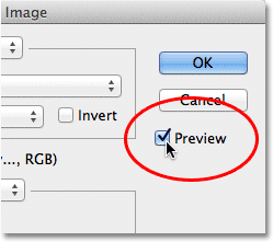
Turn the Preview option on and off to compare the current result with the original photo.
You'll most often find, especially when working with photos of people, that the Soft Light and Overlay blend modes will give you the best results, but a couple of other useful blend modes you'll want to try are Screen and Multiply. Screen will lighten everything in the image, while Multiply will darken everything. Try them out with each of the three color channels to see what you get, then fine-tune the effect by raising or lowering the opacity value. For example, here I've set my Channel to Green, the Blending option to Multiply, and I've lowered the Opacity value down to 40%:
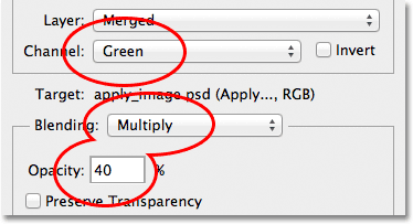
Channel = Green, Blending = Multiply, Opacity = 40%.
The result is darker, more detailed version of the image:
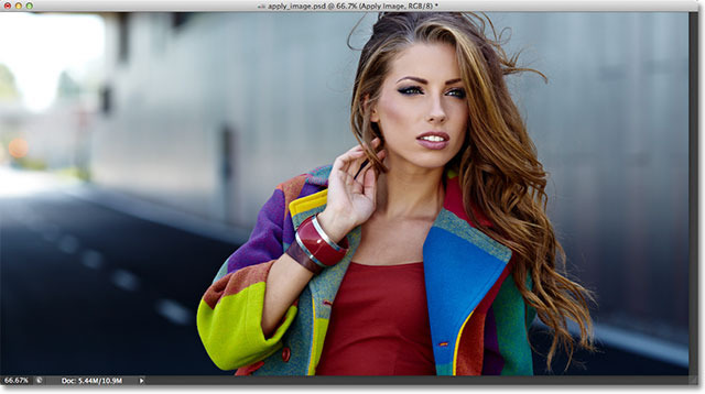
The Multiply blend mode is great for darkening the image. Try the Screen blend mode to lighten it.
When you're happy with the results, click OK to close out of the Apply Image dialog box. You can then compare the effect again with the original image in the document window by clicking on the layer visibility icon (the eyeball) on the far left of the Apply Image layer in the Layers panel. Click it once to turn the Apply Image layer off and view the original photo. Click it again to turn the Apply Image layer back on:
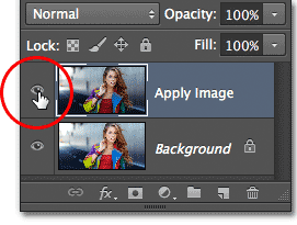
Toggle the layer visibility on and off to compare the final result with the original version.
Tutorial 2
Step 1: Duplicate The Background Layer
With my image newly opened in Photoshop, if we look in my
Layers panel, we see the photo sitting on the
Background layer, currently the only layer in my document:

The Layers panel showing the photo on the Background layer.
The first thing we need to do for our soft glow effect is make a copy of the Background layer, and the easiest way to do that is to click on the Background layer and drag it down onto the New Layer icon at the bottom of the Layers panel (it's the second icon from the right):

Dragging the Background layer onto the New Layer icon.
Release your mouse button when your hand cursor is directly over the New Layer icon. Photoshop will make a copy of the Background layer, name the new layer "Background copy" and place it above the original:

The "Background copy" layer appears above the original Background layer.
Step 2: Rename The New Layer
It's always a good idea to rename layers in your Layers panel so you have a better sense of what's on each layer and what it's being used for. Let's give the "Background copy" layer a more descriptive name. To rename a layer, simply double-click directly on its name in the Layers panel. This will highlight the current name:

Double-clicking on the name "Background copy" to highlight it.
Since we'll be using this layer to create our soft glow effect, let's name it "Soft Glow". Press Enter (Win) / Return(Mac) on your keyboard when you're done to accept the name change:

The "Background copy" layer is now the "Soft Glow" layer.
Step 3: Apply The Gaussian Blur Filter
To create the actual soft glow effect, we'll first apply some blurring to the "Soft Glow" layer. Then we'll change the way the blurred layer mixes with the original image below it by changing its blend mode.
To blur the layer, we'll use Photoshop's Gaussian Blur filter. Go up to the Filter menu in the Menu Bar along the top of the screen, choose Blur, and then choose Gaussian Blur:

Going to Filter > Blur > Gaussian Blur.
This opens the Gaussian Blur dialog box, which lets us control the amount of blur being applied to the layer using the Radius slider along the bottom. The further you drag the slider to the right, the stronger the blur effect will appear. Photoshop gives us a live preview of the effect in the document, so keep an eye on your image as you drag the slider to judge the results.
We don't want to blur the image so much that our subject becomes unrecognizable. We're just trying to soften things up a bit, so lower radius values tend to work best. Keep in mind, though, that the blur amount that works best for your specific image may be different from mine and will depend a lot on its size, with larger photos needing more blurring than smaller ones. Generally, for a subtle glow effect, a radius value of somewhere around 10 pixelsshould work well:

For a subtle glow, use smaller radius values.
Here's what my blur effect looks like with a radius value of 10 pixels. Notice that while the photo looks softer than it did before, we can still make out plenty of detail. We'll see even more detail once we change the layer's blend mode in the next step:

The blurring effect with a radius of 10 pixels.
For an even softer, more dream-like glow effect, try a larger radius value of around 20 pixels:

For a more dream-like glow, use a larger radius value.
Here's my blurring effect using a 20 pixel radius. We can still make out detail in the photo, but the blurring is definitely stronger this time. Choosing the right amount of blur is really a personal choice and will depend on the image. In my case, I think this is too much so I'll go with the smaller 10 pixel radius. When you're happy with the results, click OK to close out of the Gaussian Blur dialog box:

The blurring effect with a radius of 20 pixels.
Step 4: Change The Blend Mode To Soft Light
Now that we've blurred the "Soft Glow" layer, let's change the way it interacts with the original image on the Background layer below it. We do that by changing its blend mode. You'll find the Blend Mode option in the upper left of the Layers panel. By default, it's set to Normal. Click on the word "Normal" to bring up a menu of other blend modes and choose Soft Light from the list:

Changing the layer blend mode from Normal to Soft Light.
The Soft Light blend mode in Photoshop does two things; it boosts the overall contrast in the image, and it enhances the colors, making them appear more vibrant. Here's my image with the blend mode set to Soft Light, giving everything a warm, subtle glow:

The effect using the Soft Light blend mode.
For a stronger effect, try the Overlay blend mode instead. The Overlay blend mode is very similar to Soft Light, boosting contrast and color, but where Soft Light is more subtle, Overlay is more intense:

Changing the blend mode from Soft Light to Overlay.
Here's my result with the Overlay blend mode. Overlay may work better with a different image, but in this case, it's too strong so I'll go with Soft Light instead:

The result using the Overlay blend mode.
Step 5: Lower The Layer Opacity
To fine-tune the effect, simply lower the layer's opacity. You'll find the Opacity option in the upper right of the Layers panel, directly across from the Blend Mode option. The default opacity value is 100%. The more you lower it, the more the original photo below the "Soft Glow" layer will show through. In other words, we’ll see more of the original image and less of the blurred image.
To change the opacity value, click on the small arrow to the right of the current value, then drag the slider. I'll lower mine to around 75%, but again, you'll want to keep an eye on your image as you drag the slider to judge the results:

Lowering the opacity of the "Soft Glow" layer.
Here, after lowering the opacity, is my final soft glow effect:

The final result.
And there we have it! That's the quick and easy way to add a soft glow effect to an image with Photoshop!