Monday, February 29, 2016
Wk 26 Badges
DPI 1
<img src="https://docs.google.com/drawings/d/1KUVFTmj1bpxmekn-Pji0Y8BNx4Kp6rwCetXBclLMFPY/pub?w=72&h=72">
DPI 2
<img src="https://docs.google.com/drawings/d/1KUVFTmj1bpxmekn-Pji0Y8BNx4Kp6rwCetXBclLMFPY/pub?w=72&h=72">
DID
<img src="https://docs.google.com/drawings/d/1KUVFTmj1bpxmekn-Pji0Y8BNx4Kp6rwCetXBclLMFPY/pub?w=72&h=72">
COMM
<img src="https://docs.google.com/drawings/d/1KUVFTmj1bpxmekn-Pji0Y8BNx4Kp6rwCetXBclLMFPY/pub?w=72&h=72">
Thursday, February 25, 2016
Tuesday, February 23, 2016
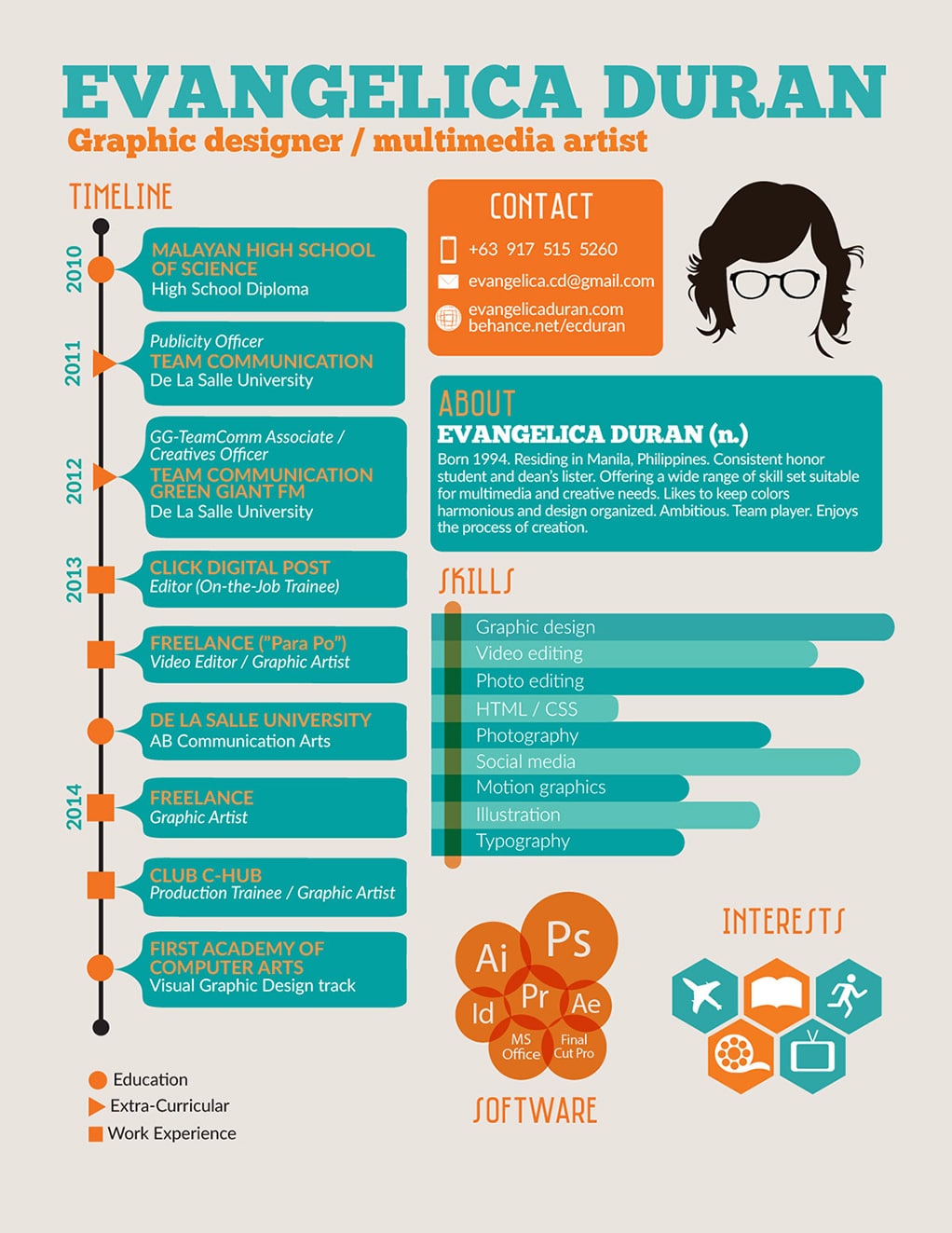
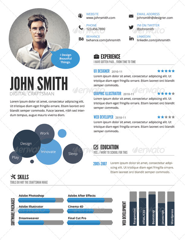
DID: Infographic Resume
Samples


Project
List what a resume is used for:
- getting a job
- college applications
- scholarship applications
- to give to those you would like to write letter of recommendations for you
Tips can be found www.heygetajob.com on the resume templates link. This should lead into a discussion of the basics of resume writing .
- Resumes must be typed
- Print resumes on high quality paper – office supply stores call it resume paper
- Keep your resume to one page
- Use a proper format – use a template
- Write in the active voice
- No: I have written
- Yes: I wrote
- Focus on these three skills – point out to students that even if they have no work experience, they should have skills to put in a resume
- communication skills
- problem solving skills
- technical skills
- Pay attention to words
- Brainstorm a list of words with students to use on resumes.
- They should come up with 25-50 to get the idea of work-oriented action words.
- Some examples:
- assisted, implemented, contributed, organized, planned, trained, supervised, selected, earned, presented, mediated, taught, represented
- Tell the truth – that includes exaggeration
- References – this is often times not on a resume, but they need to understand they will need to have contact information for the standard three references
- Customize the resume for the purpose – a job resume is going to be different from a resume for a college application.
Things to Include:
- Objective – one sentence that states why you’re sending the resume to them and it’s a worthwhile place to plug some positive characteristics.
- Challenging or relevant workplace oriented classes they’ve taken in school. Their GPA , if it’s good.
- Work experience if they have any. Most recent job, what they did and for whom, list of duties (remind them of the words you brainstormed earlier).
- Volunteer or community service .
- Stress the importance of this, particularly if they have little to no work experience.
- List their title or roll, what they did and for whom, list of duties.
- Talents or skills they have that would be relevant.
- Honors and awards (academic, athletic, community)
- Extra-curricular activities – clubs, associations, activities outside of school, hobbies and interests.
Badges for Wk 25
DPI 1
<img src="https://docs.google.com/drawings/d/1B9pw5xCVpgV-c8Ulqdb7k1LtmO_QllrLYHs-JnmQSEY/pub?w=72&h=72">
DPI 2
<img src="https://docs.google.com/drawings/d/1vUzEssQqIu3VythfJH1-g_quUK555lYA3OiGCdN-abU/pub?w=72&h=72">
DID
<img src="https://docs.google.com/drawings/d/1ZE1KsqRmtwIzdnqgfFlfEEqyyq4Q8N2Aqpo-5f7FcWs/pub?w=72&h=72">
COMM
<img src="https://docs.google.com/drawings/d/1VSCdACY4UU8aMIwXn7Oo-3Qjbf7D9zuspDVsdExJTWk/pub?w=72&h=72">
Wednesday, February 17, 2016
COMM: Flash Project 2 - Effects
Sample Project:
https://www.lsrhs.net/departments/fata/media_arts/flash/project_info/project_examples/negative.htmlShape Tweens
- Add a shape to the first frame of layer 1
- CONVERT TO SYMBOL (GRAPHIC)
- On frame 30 of the same layer, add the same shape
- Alter the shape's color, size, position, and distortion (distort, envelope, skew)
- Create a SHAPE TWEEN between frame 1 and 30
- This will create a SHAPE TWEEN
Effects
- Create a shape on the first frame of layer 1
- CONVERT TO SYMBOL (MOVIE CLIP)
- On frame 30 of the same layer, add the same shape
- Add an PROPERTY EFFECT (STYLE or FILTER)
- Create a CLASSIC TWEEN between frame 1 and 30
- This will create an EFFECT through CLASSIC TWEEN
Other Tips
- To create a "loop" the first and last frame of the animation need to be exactly the same
- You can copy the first frame and past it at the end, then add a TWEEN between
- Or, before you add your TWEENS; INSERT KEYFRAME multiple times and then TWEEN
DPI 1: Try to Match the Images
Match the Image
Using the knowledge and skills you have developed over the last two semesters, try to match the below images.- First, look at each image. Study the editing and effects being used. Be observant and detail orientated!
- Second, determine what tools and methods you will need.
- Third, experiment. You may not get things right on the first try!
- Lastly, match each of the images below using your own images.
- Post your images to your blog.
Brady: Soft edges, black and white/sepia, contrast, brightness, blurs, burn and dodge
Adams: high contrast, deep shadows, burn and dodge, full grays, blurs, layer blending modes
Cameron: serpia, soft tones, blurs, soft edges, vignette, burn and dodge, layer blending modes, masking, adjustment layers, gradient overlay

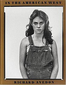
Avedon: border/edging, high contrast, levels, burn and dodge, layer blending modes
(just the black and white border - you do not need the gold border or the text)
Leibovitz: high contrast, shadows and highlights, high pass, color tints, photo filter, hue/sat, levels, burn and dodge, layer blending modes, masking
Uelsmann: blending to images together (eraser, masking, etc.), vignette, shadows, high pass, burn and dodge, curves, layer blending modes, layers
You are being evaluated on MATCHING - how well did you copy the images?
Friday, February 12, 2016
Green and White Review
DIG ILL: Green and White Review Cover
Green and White Review
The Green and White Review literary magazine features poetry, short stories, and reflections on life at Plainfield Central High School and the world beyond. The magazine is written entirely by Plainfield Central High School students.
Digital Illustration students design the FRONT and BACK cover.
Requirements:
- 9" x 12" FRONT
- 9" x 12" BACK
- Graphic Design/Visual Comm.
- Typography
- Layout
- Color Harmonies
Text on the FRONT cover:
- Green and White Review
- Literary Magazine
- Plainfield Central High School
- 2014 - 2015
Samples:
Thursday, February 11, 2016
Photo 1 Notes and PhotoCheck
Notes on the "Masters of Photography"
Masters of Photography from Aaron Lawler
Project Requirements
- Choose one of the masters to mimic
- Take 15 photos in the style and likeness of your Master
- Match the likeness: subject matter and composition (ie. if you choose Ansel Adams, you should take pictures of landscapes using the rule of thirds)
- Match the style: color, editing, contrast, border (ie. if you choose Ansel Adams, you should be editing in black and white, with high contrast, and a lot of burn/dodge)
- Choose your 10 best photos
- Edit your images to the best of your ability
- Complete the questionnaire of "Why I chose this Artist?"
PhotoCheck 2/16
- Take 15 photos in the style and likeness of your Master
- Organize them from best to worst (ie. 001 = best photo, 010 = mediocre/average photo, 015 = worst photo)
Tuesday, February 9, 2016
Photo 2 Tutorial Check
PHOTO 2 Tutorials
- Chrysotype
- Cyanotype
- Daguerreotype
- Kallitype
- Carte de Visite
- Gum Printing
Post all six (6) to your blog!
Friday, February 5, 2016
Blue Lake Fine Arts Camp
http://bluelake.org/
"Blue Lake Fine Arts Camp, a summer school of the arts located on a 1,400 acre campus in Michigan’s Manistee National Forest, offers fine arts education for all ages. Each summer, the principal camp program serves more than 5,400 gifted elementary, junior high, and high school students with diverse programs in music, art, dance, and drama while offering more than 175 performances during its Summer Arts Festival. Blue Lake also operates a widely acclaimed International Exchange Program and two public radio stations. Since its inception in 1966, Blue Lake has provided cultural enrichment to more than 300,000 gifted students and countless concert-goers."
http://bluelake.org/international/index.php
Monday, February 1, 2016
Photo 1 Tutorials
Photo 1 Tutorials
Complete the following tutorials:Soft Haze Effect
http://photographypla.net/soft-haze-effect-in-photoshop/Cinematic Effect
http://shutterpulse.com/how-to-create-a-cinematic-effect-in-photoshop/HDR Photo Effects
http://shutterpulse.com/hdr-effects-in-lightroom-and-photoshop/Color Effect
http://design.tutsplus.com/tutorials/color-effect--psd-14791
Badges
DPI 2
<img src="https://docs.google.com/drawings/d/1Swj2NKzux4dWjTUnZyLtWtgvbhscmG_l02twgzD0nVw/pub?w=72&h=72">DPI 1
<img src="https://docs.google.com/drawings/d/1TVQ2CDdjUnEb6eWYNobU5hoR_0Kl2q_P0D4KMGAd5i8/pub?w=72&h=72">DID
<img src="https://docs.google.com/drawings/d/1jS0pzojRl6CEvgv3EHcer6jEpRAo6NWDXv60dpw2Zak/pub?w=72&h=72">COMM
<img src="https://docs.google.com/drawings/d/1qK8wwHCW_J-YcLSaT4JCi4E6rAdzVAHtX1BUSO9aoic/pub?w=72&h=72">
Subscribe to:
Comments (Atom)


